The importance of Composition and Impact in Film and Photography.
A basic run down of the important factors to consider when composing scenes, whether in photography or film. This is a cut down and edited version of the 'Composition and Impact" article at istockphoto.com. This is a classic beautiful rose shot. The frame is full of nothing but soft rose petals. Enough detail you feel you could reach out and touch them. The light is just right, creating just enough shadow to make each petal stand out from the others, and you get lost in that beautiful swirl of pink. No distracting vase or table.
- photographer has gotten in really close
- cropping off the man's chin and most of the top of his head
- focus is on that wonderful genuine smile,
- emphasized by the laugh lines at the eyes and a bit of a dimple on the subject's cheek
- all bringing your attention right back to that fantastic smile.
Train yourself to see your subjects in terms of lines and shapes. Sometimes lines in a photograph are obvious, like the horizon in a sunset picture, other times the main lines in a photograph are not. Squint your eyes until the image almost becomes a blur, then you'll see any lines and shapes created by the shadows and light.
Composition
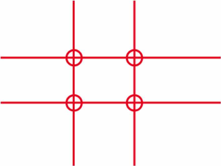
The Rule Of Thirds And The Golden Mean Divide shot into thirds, both vertically and horizontally, like a tic-tac-toe (noughts and crosses) board.  So if you are composing a scene of a sunset, try placing that horizon line one-third of the way from the top or bottom of your image, to include either more foreground or more sky. You'll notice a stronger landscape this way.
  Kind of boring if it is in the centre. If you place your horizon at the bottom third line, it will emphasize a beautiful sky, while still giving the viewer enough of the landscape to feel as if they're a part of the picture. If perhaps your sky isn't quite so interesting, you can place your horizon at the upper third line of the photo. This will add more depth to your foreground and give the viewer the feeling that they are standing right there, with their feet firmly planted in your photograph, as in the photo below:

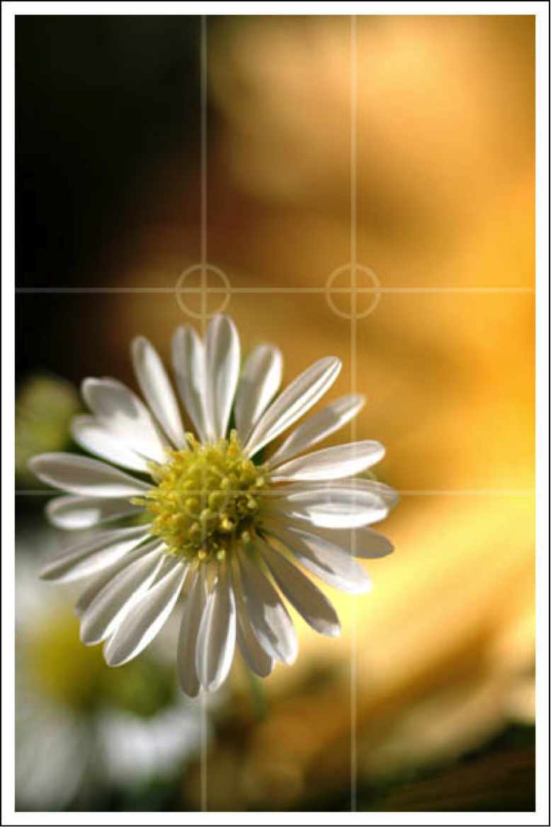
Golden Mean The main subjects of an image should be placed at the intersecting points created (roughly). The background itself is not distracting. The subject stands out well, even though there are other flowers in the background.
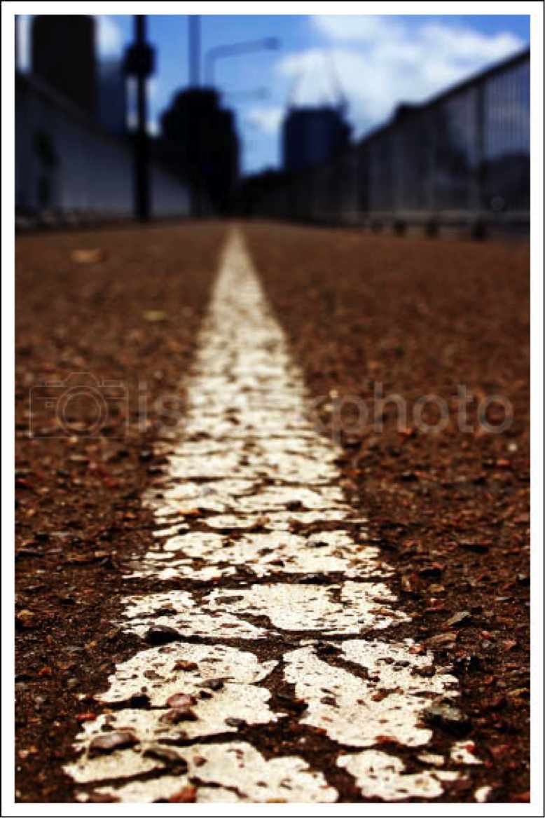
Leading Lines Notice that the painted line on the road leads your eye into the image, meeting the horizon line, which is one third of the way down into the image. Leading lines can be found in many other ways, not just paths and roads. The edges of the petals of a daisy can be leading lines moving into the center of the flower. A row of trees or street lights that vanish in the distance can create very strong leading lines that take the viewer's eye all the way through an image.
Rhythm Another way to create dynamic impact in your photograph is with the use of "visual rhythm". This is a way to use repetition of form and shape in an image to create interest. All of the similar vertical lines work together in this image. The simplicity of the brown bark contrasted against the snow and colorless sky particularly makes the visual pattern of repeating lines stand out in this shot.  Another use of rhythm, created by the replication of the lines of each archway. Negative Space Negative space is a term used in photography that implies only a tiny fraction of the frame is taken up by the actual subject. Negative space is usually used either to make the subject seem very small, or to give the impression of the subject being in a wide-open space.
 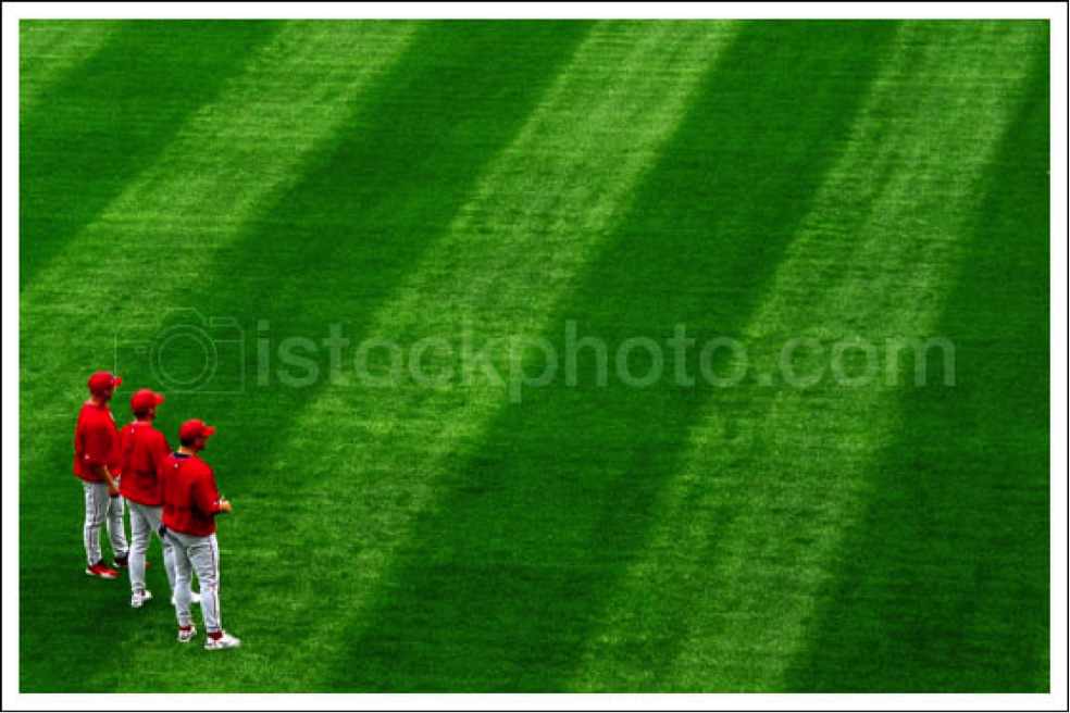 Surrounded by so much vivid green space, the feeling that you get is that of a wide-open, never-ending field of grass - turning the negative space itself into as much of the subject as the players. The contrasting, saturated reds and greens really make the picture as a whole stand out, as well as the fact that they players are facing out into the vast expanse of green. This is a cut down and edited version of the 'Composition and Impact" article at istockphoto.com.
Leave a comment
Comments will be approved before showing up.





.Digislider Team
Author